复习回顾——页面布局

如图,需要实现的布局为经典的三列布局(logo、导航、登录注册按钮)。
对于这种情况首先想到的应该是这样的。

也就是说在一个大的容器中,我们在写入一个容器(红色)作为存放绿色容器、蓝色容器、紫色容器 。那么实现起来就很简单了。
x
1<!-- 黑色的大容器 -->2<header class="head">3 <!-- 红色部分 -->4 <div class="container">5 <!-- 绿色部分 -->6 <div class="logo"></div>7 <!-- 蓝色部分 -->8 <div class="nav"></div>9 <!-- 紫色部分 -->10 <div class="login"></div>11 </div>12</header>第一步需要做的就是黑色的容器的宽度设置为100%,这是为了给里边的元素实现居中。
xxxxxxxxxx1.head {2 width: 100%;3}第二步就是实现红色容器的居中并且设置宽高。这一步也很简单,因为黑色的已经有了宽度,那么只需要进行外边距左右自动即可。
xxxxxxxxxx1.head .container {2 width: 1200px;3 height: 90px;4 margin: 0 auto;5}第三步即调整绿色容器、蓝色容器、紫色容器 的位置问题
实现之前,应首先设置他们的宽高,为了方便同时设置上背景色,方便调整。
x
1/* 左侧绿色div */2.head .container .logo {3 width: 80px;4 height: 90px;5 background-color: green;67}8/* 中间蓝色div */9.head .container .nav {10 width: 420px;11 height: 90px;12 background-color: blue;13}14/* 右边紫色div */15.head .container .login{16 width: 240px;17 height: 90px;18 background-color: purple;19}第一种方案:通过浮动实现
这种方法很简单。
第一步:左侧与中间设置为浮动
第二步:调整中间距离左侧的距离(
margin-left)第三步:右侧使用右浮动即可。
xxxxxxxxxx101.head .container .logo,2.head .container .nav{3float: left;4}5.head .container .nav{6margin-left: 20px;7}8.head .container .login{9float: right;10}
第二种方案:定位
这种方法也很容易理解。
第一步:为父级容器开启相对定位(因为不脱离文档流)
第二步:为每个子集元素(绿蓝紫div)设置绝对定位。
第三步:利用
top、left调整每个div的位置。xxxxxxxxxx211/* 为父级开启相对定位 */2.head .container {3position: relative;4}5/* 将每个div设置为绝对定位 */6.head .container .login,7.head .container .logo,8.head .container .nav {9position: absolute;10top: 0;11}12/* 调整每个的位置 */13.head .container .logo {14left: 0;15}16.head .container .nav {17left: 180px;18}19.head .container .login {20left: 1000px;21}
第三种方案:利用表格
这种方法也很简单。
第一步:将父级的显示为表格
第二步:子级显示为单元格
xxxxxxxxxx101/* 将父级的显示为表格 */2.head .container {3display: table;4}5/* 子级显示为单元格 */6.head .container .login,7.head .container .logo,8.head .container .nav {9display: table-cell;10}
但是这个方法存在一些问题,如图,使用表格后会默认将其填充满,无法使用宽高进行设置。解决方法也很简单,使用内边距即可解决位置问题。因为不需要使用背景色,所以在效果上是看不出来问题的。
参考演示:https://gethtml.cn/project/2020/03/23/center-3.html
第四种方案:外边距
这种方法简单暴力。利用
margin-top、margin-left即可调整各元素的位置。xxxxxxxxxx121.head .container .nav {2margin-left: 180px;3}45.head .container .login,6.head .container .nav {7margin-top: -90px;8}910.head .container .login {11margin-left: 1000px;12}第五种方案:内联元素
这种方法利用行内块级元素的特性可以实现。
xxxxxxxxxx1/* 将元素设置为inline-block */2.head .container .logo,3.head .container .nav,4.head .container .login {5display: inline-block;6}7.head .container .nav {8margin-left: 180px;9}10.head .container .login {11margin-left: 270px;12}
第四步就是该在这些元素中填充内容了。
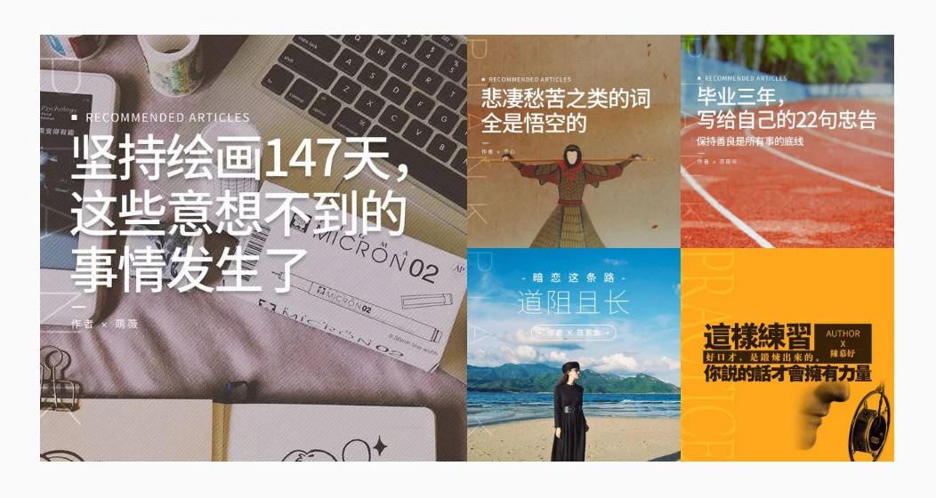
实现片刻网的导航栏

复习了上面的布局后很容易实现这个效果。
参考演示:https://gethtml.cn/project/2020/03/23/index1.html
1971<html lang="en">3 <head>4 <meta charset="UTF-8" />5 <meta name="viewport" content="width=device-width, initial-scale=1.0" />6 <title>Document</title>7 <style>8 * {9 box-sizing: border-box;10 }11 body {12 margin: 0;13 padding: 0;14 width: 100%;15 height: 100%;16 background-color: #fafafa;17 background-image: url("./imgs/bgImg.png");18 background-repeat: repeat-x;19 }20 body a {21 color: #000;22 text-decoration: none;23 }24 .head {25 width: 100%;26 background-color: #fff;27 box-shadow: 0 2px 5px rgba(0, 0, 0, 0.1);28 }2930 .head .container {31 width: 1200px;32 height: 90px;33 margin: 0 auto;34 }3536 .head .container .logo {37 width: 80px;38 height: 90px;39 }4041 .head .container .nav {42 width: 420px;43 height: 90px;44 }4546 .head .container .login-container {47 width: 240px;48 height: 90px;49 margin-left: 1000px;50 /* 开启相对定位是因为子级需要绝对定位 */51 position: relative;52 }5354 .head .container .nav {55 margin-left: 180px;56 padding: 0;57 list-style: none;58 margin-bottom: 0;59 }6061 .head .container .login-container,62 .head .container .nav {63 margin-top: -90px;64 }6566 /* 顶部导航栏logo */67 .head .container .logo a {68 display: block;69 width: 80px;70 height: 90px;71 padding-top: 26px;72 }73 .head .container .logo img {74 display: block;75 width: 100%;76 height: auto;77 }78 /* 顶部导航中的菜单 */79 /* 为每一个列表内容设置样式 */80 .head .container .nav li {81 float: left;82 width: 84px;83 height: 90px;84 text-align: center;85 line-height: 90px;86 cursor: pointer;87 }88 /* 选择没有被选中的标签 */89 .head .container .nav li:not(.active) {90 transition: all 0.2s;91 }92 /* 没有被选中的标签鼠标悬停时的效果 */93 .head .container .nav li:not(.active):hover {94 font-size: 120%;95 background-color: #fbfbfb;96 }97 /* 标签被选中后 */98 .nav li.active {99 background-color: #fbfbfb;100 font-weight: bolder;101 box-shadow: inset 0 -3px 0 0 #333;102 }103 /* 顶部导航中的登录与注册 */104 .head .container .login-container div {105 /* 通过绝对定位实现上下居中 */106 position: absolute;107 left: 0;108 top: 50%;109 transform: translateY(-50%);110 }111 .head .container .login-container .write {112 width: 44px;113 height: 44px;114 border-radius: 50%;115 border: 1px solid #57ad68;116 }117 .head .container .login-container .write div {118 width: 38px;119 height: 38px;120 background-color: #57ad68;121 border-radius: 50%;122 margin-left: 2px;123 cursor: pointer;124 transition: all 0.2s;125 }126 .head .container .login-container .write div:hover {127 box-shadow: inset 0 0 10px #fff;128 }129 .head .container .login-container .write div img {130 width: 20px;131 height: auto;132 margin-top: 9px;133 margin-left: 10px;134 }135 .head .container .login-container .login {136 width: 126px;137 height: 46px;138 left: 74px;139 border-radius: 23px;140 color: #57ad68;141 border: 1px solid #57ad68;142 text-align: center;143 line-height: 44px;144 font-size: 14px;145 font-weight: 300;146 cursor: pointer;147 transition: all 0.2s;148 }149 .head .container .login-container .login:hover {150 background-color: #57ad68;151 color: #fff;152 }153 </style>154 </head>155156 <body>157 <!-- 作为顶部导航栏的容器 -->158 <header class="head">159 <!-- 实现水平居中效果容器 -->160 <div class="container">161 <!-- 显示网页logo -->162 <div class="logo">163 <a href="#">164 <img165 src="https://cdn.jsdelivr.net/gh/blogimg/HexoStaticFile1/imgbed/2020/03/23/20200323195420.png"166 />167 </a>168 </div>169 <!-- 显示网站菜单 -->170 <ul class="nav">171 <li class="active">首页</li>172 <li>阅读</li>173 <li>电台</li>174 <li>碎片</li>175 <li>客户端</li>176 </ul>177 <!-- 登录注册 -->178 <div class="login-container">179 <!-- 写作的按钮 -->180 <div class="write">181 <div>182 <img183 src="https://cdn.jsdelivr.net/gh/blogimg/HexoStaticFile1/imgbed/2020/03/23/20200323195459.png"184 alt=""185 />186 </div>187 </div>188 <!-- 登录注册按钮 -->189 <div class="login">190 登录/注册191 </div>192 </div>193 </div>194 </header>195 </body>196</html>197
实现聚焦图片
参考演示:https://gethtml.cn/project/2020/03/23/index.html
聚焦图片的实现最简单的实现方式就是通过表格来实现,通过图片可以很容易想到八个方格,其中左边四个合并显示为一个。其他四个分别显示。
所以我们的html可以为
x
1<table>2 <tr>3 <td class="big-picture" colspan="2" rowspan="2">4 <img src="https://ae01.alicdn.com/kf/Udda8d51179294281b3ec2fdfda1fc16eV.jpg" alt="" />5 </td>6 <td>7 <img src="https://ae01.alicdn.com/kf/U1eb62310ea974465ab6c4377b2332e5cC.jpg" alt="" />8 </td>9 <td>10 <img src="https://ae01.alicdn.com/kf/U118acb8ebb1a4bcf99b1b40b6e155962L.jpg" alt="" />11 </td>12 </tr>13 <tr>14 <td>15 <img src="https://ae01.alicdn.com/kf/Udbcd215d6d294fe4b14323036064ad6bF.jpg" alt="" />16 </td>17 <td>18 <img src="https://ae01.alicdn.com/kf/U51353f36187b4bddadd8365c7f824604P.jpg" alt="" />19 </td>20 </tr>21</table>样式表为以下
xxxxxxxxxx1/* 聚焦图片 */2.focus-picture table {3 width: 100%;4 /* 属性是用来决定表格的边框是分开的还是合并的 collapse共享边框*/5 border-collapse: collapse;6 padding: 0;7 /* 指定相邻单元格边框之间的距离 */8 border-spacing: 0;9}10/* 每个单元格的大小为25% */11.focus-picture table td {12 width: 25%;13 padding: 0;14 border-spacing: 0;15}1617.focus-picture table td img {18 width: 240px;19 display: block;20}2122.focus-picture table .big-picture img {23 width: 480px;24}通过其他方式实现聚焦图片的布局
这里我先将html结构改为
xxxxxxxxxx71<div class="focus-picture">2 <img src="https://ae01.alicdn.com/kf/Udda8d51179294281b3ec2fdfda1fc16eV.jpg" alt="" />3 <img src="https://ae01.alicdn.com/kf/U1eb62310ea974465ab6c4377b2332e5cC.jpg" alt="" />4 <img src="https://ae01.alicdn.com/kf/U118acb8ebb1a4bcf99b1b40b6e155962L.jpg" alt="" />5 <img src="https://ae01.alicdn.com/kf/Udbcd215d6d294fe4b14323036064ad6bF.jpg" alt="" />6 <img src="https://ae01.alicdn.com/kf/U51353f36187b4bddadd8365c7f824604P.jpg" alt="" />7</div>通过margin实现布局
参考演示:https://gethtml.cn/project/2020/03/23/index-margin.html
1.content img{2 display: block;3}4.content img:not(:first-child){5 width: 240px;6 height: auto;7}8.content img:first-child{9 width: 480px;10 height: auto;11}12/* 第二个图片 */13.content img:nth-of-type(2){14 margin-top: -480px;15 margin-left: 480px;16}17/* 第三个图片 */18.content img:nth-of-type(3){19 margin-top: -240px;20 margin-left: 720px;21}22/* 第四个图片 */23.content img:nth-of-type(4){2425 margin-left: 480px;26}27/* 第五个图片 */28.content img:nth-of-type(5){29 margin-top: -240px;30 margin-left: 720px;31}当然了,也可以将图片设置为浮动,然后在配合外边距也能达到效果。
通过定位实现布局
参考演示:https://gethtml.cn/project/2020/03/23/index-position.html
xxxxxxxxxx341/* 为父级容器开启相对定位 */2.content{3 position: relative;4}5/* 为所有图片开启绝对定位 */6.content img{7 position: absolute;8 top: 0;9}10/* 选择非第一张的所有图片 即四张小图 */11.content img:not(:first-child) {12 width: 240px;13 height: auto;14}15/* 选择第一张图片 */16.content img:first-child {17 width: 480px;18 height: auto;19}20.content img:nth-of-type(2){21 left: 600px;22}23.content img:nth-of-type(3){24 left: 840px;2526}27.content img:nth-of-type(4){28 left: 600px;29 top: 240px;30}31.content img:nth-of-type(5){32 left: 840px;33 top: 240px;34}